��ʵ�õ���ҳ�������:����û�ϲ������ҳ����(4)
3. Actions
3.����
* Primary vs. secondary actions Primary actions are links and buttons in a form that perform essential “final” functionality, such as “Save” and “Submit.” Secondary actions, such as “Back” and “Cancel,” enable users to retract data that they have entered. If clicked by mistake, secondary actions typically have undesired consequences, so use only primary actions where possible. If you must include secondary actions, give them less visual weight than primary actions.
�� ��Ҫ�����ʹ�Ҫ��������Ҫ��������ִ������ܵ����ӺͰ�ť������“����”��“�ύ”����Ҫ����������“����”��“ȡ��”���������û������Ѿ���������ݡ����������ˣ���Ҫ����һ�����������Ľ�������Ծ���ֻ����Ҫ�������������Ҫ�д�Ҫ��������ôҲҪ�����ǿ�����û��Ҫ������ô���ۡ�
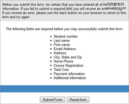
Not clearly distinguishing between primary and secondary actions can easily lead to failure. The above action buttons are found at the end of a lengthy form for enrolling in St. Louis Community College. Just imagine pressing the “Reset Form” button by accident.
����ȷ�������β���������׳��¡�����IJ�����ť������ʥ·��˹������ѧ�����ı�����������棬���뿴����“���������reset form��”�ĺ���ɡ�
* Naming conventions Avoid generic words such as “Submit” for actions, because they give the impression that the form itself is generic. Descriptive words and phrases, such as “Join LinkedIn,” are preferred.
�� ��������������ʹ��“ע��”֮��ij��������������û���������������û��˼����“����LinkedIn”֮��������Ե��ʻ��������һЩ��
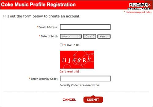
Although Coca-Cola correctly gives more importance to the primary action button, it settles for the generic word “Submit.” “Register with us” would have been more helpful.
�����ɿڿ��������β����Ĵ��������úܺã�����ȴ����һ����ƽ����“ע�ᣨsubmit��”������“�������ǣ�register with us��”���������Ч��
4. Help
4.����
* Text to accompany forms Your should never have to explain to users how to fill out a form. If it does not look like a form or it’s too complicated to fill out, then redesigning it is your only option. Accompanying text should be used only where needed, such as to explain why credit card data is being requested or how a birth date will be used or to link to the “Terms and conditions.” Such text tends to be ignored, so make it succinct and easy to read. As a rule of thumb, do not exceed 100 words of explanation (combined).
�� ����˵���������õı�������Ҫ���͡�����ǿ���������������ߺ�����д����ôֻ����������ˡ���������ֻӦ��������Ҫ�ĵط����������Ϊʲô��Ҫ���ÿ���Ϣ�����߽��ͳ������ڵ���;���������ӵ�“���������”����Щ���ֺ����ױ����ӣ�����Ҫ���ü��������һ����ǣ��������֣��ܹ�����Ҫ����100�֡�
* User-triggered and dynamic help Rather than include help text next to each input field, show it only where required. You could show an icon next to an input field that the user can click on when they need help for that field. Even better, show help dynamically when the user clicks into an input field to enter data. Such implementation is becoming more common and is relatively easy to implement with JavaScript libraries such as jQuery.
�� �û������Ͷ�̬������������ÿ����������ϰ������֣���������ֻ����Ҫʱ�ų��֡��������������Ա߷Ÿ�Сͼ�꣬���û�����Ҫʱ���е����������������õģ����û�������������������ʱ����̬��ʾ������Ϣ������Ӧ��Խ��Խ�ձ飬ʹ��JavaScript�Ŀ⣬����jQuery֮��ģ�������ʵ������Ч����
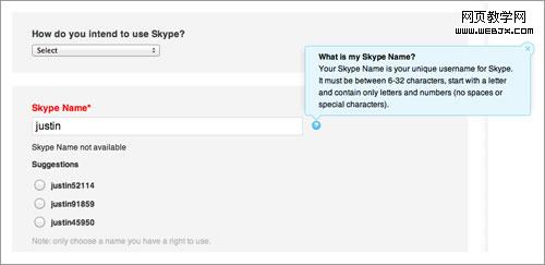
Skype’s registration form contains both user-triggered help (the blue box that is triggered by clicking the question mark) and dynamic help (the suggested user names).
Skype��ע������Ȱ������û�������������ɫ���ı�����ͨ������ʺ�ͼ�괥���ģ���Ҳ�����˶�̬�����������û�������
5. Messages
5.��Ϣ
* Error message This notifies the user that an error has occurred, and it usually prevents them from proceeding further in the form. Emphasize error messages through color (typically red), familiar iconography (such as a warning sign), prominence (typically at the top of the form or beside where the error occurred), large font, or a combination of these.
�� ������Ϣ����֪�û��д���ͨ������ֹ�û�������д����������ͨ�����·�����ǿ��������Ϣ����ɫ��һ���Ǻ�ɫ������֪ͼ�Σ��羯���־����ͻ����ʾ��ͨ���ڱ����Ϸ����Ƿ�������IJ�ߣ��������壬���������ۺϡ�
* Success message Use this to notify users that they have reached a meaningful milestone in the form. If the form is lengthy, a success message encourages the user to continue filling it out. Like error messages, success messages should be prominent. But they should not hinder the user from continuing.
�� �ɹ���Ϣ�����Ը�֪�û����Ѿ�����˱�����һ����Ҫ���֡���������ܳ����ɹ���Ϣ���Թ����û�������д����������Ϣһ�����ɹ���ϢҲӦͻ����ʾ�����Dz�����ֹ�û�������д������
6. Validation
6.��֤
* Only where needed Excessive validation is as bad as its complete absence, because it will frustrate users. Restrict validation to confirming key points (such as the availability of a user name), ensuring realistic answers (such as not allowing ages above 130) and suggesting responses where the range of possible data is finite but too long to include in a drop-down menu (such as a country-code prefix).
�� ֻ����Ҫʱ��֤���������֤����ȫû�е�Ч��һ����������û��ܴ졣��֤��������ȷ���ص���Ϣ��������֤һ���û����Ƿ���ã���ȷ������ʵ����������д130�����ϵ����䣩�������ݵķ�Χ������̫������һ�������˵���ʾ��ȫʱ�������������飨����һ�����ҵĴ���ǰ����
* Smart defaults Use smart defaults to make the user’s completion of the form faster and more accurate. For example, pre-select the user’s country based on their IP address. But use these with caution, because users tend to leave pre-selected fields as they are.
�� ����ȱʡ��ʹ������ȱʡ��Ϊ�����û������ȷ�������������磬�����û���IP��ַ����ѡ������ҡ�����ʹ����ЩʱҪ����С�ģ���Ϊ�û�һ�㲻��ȥ����Щ����ѡ���
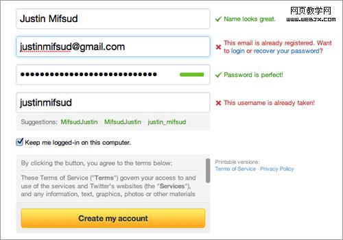
Twitter’s registration form uses both dynamic validation (for the name, email address, password and user name) and smart defaults (“Keep me logged in”).
Twitter��ע�����ʹ���˶�̬��֤�������������䡢������û����ϣ�������ȱʡ��“���ֵ�¼״̬”����
Conclusion The Beginning
������ ����
The word “conclusion” is not right here. Let this be your starting point to take what I have written about and apply it to your own forms. The good news is that there is much more to say about all this; you can find an abundance of resources on each point made here. For starters, three books are listed below that inspired me when writing this post. As I stated at the beginning, taking shortcuts by only tweaking the UI will not make your forms more usable. What more can I say? The theory is now with you. Go get your hands dirty.
����������������ﲻȷ�����������Ϊ��ѧ�����õ����ɡ�������Щ���кܶ�����о��������ÿһ�㶼�����ҵ��ḻ����Դ�������������¿�ʼʱ˵�ģ�ͨ����UI�߽ݾ��ķ�������������ı��������á������һ�Ҫ˵��ʲô���������Ѿ�������Щ�����ˣ����ָɰɡ�